About Accupredict Driver Finish Projections
By Cliff DeJong
NOTE: Accupredict creator Cliff DeJong wrote this article in 2012 as a laymen friendly introduction to statistics and fantasy NASCAR. His aim is to help fantasy NASCAR players understand the relevance of statistics regardless of their understanding of statistical formulas and methods.
In June 2021, Cliff requested the calculation values for the 337 races Accupredict had ranked since 2012, so he could audit his algorithm and performance. Cliff's follow-up report is below this first article. Jump to the '2021 Relook'

INTRODUCTION
This report examines several driver performance measures and develops a method for predicting the finishing order of NASCAR Cup Series races. It will also identify several metrics that will be used to forecast NASCAR outcomes. As well, how to combine these to get the best forecast.
The weekly implementation of this method is available as ACCUPREDICT to OWNER level subscribers on this site. The AccuPredict method was used without alteration to score 22nd overall in 2011 on nascar.com NASCAR Fantasy Live out of several thousand competitors. Additionally, this site has received several great success stories from members who have had using it in their particular fantasy NASCAR games.
ARTICLE SUMMARY
This is not a rigorous scientific paper, rather it is intended to show the methods used in general terms. NASCAR data from 1991 through 2011 was used to develop six Key Performance Metrics:
- Average Finish over the last 18 races
- Year-to-date Driver Rating*
- Finishes at the last eight tracks of the same type
- Driver Rating* at the same track for the last eight races
- Practice Rank
- Starting position
*Driver Rating is the NASCAR Loop Driver Rating, a formula that combines wins, finishes, green flag passes and several other driver performance measures.
There is a lot of randomness in NASCAR
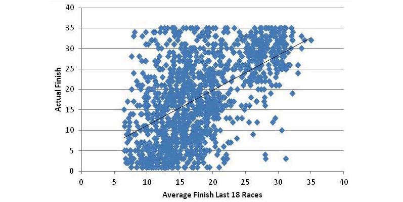
The plot shown in FIGURE 1 shows one of the better measures that I have found for predictions. It shows the actual finish of each driver plotted against the average of the last 18 races prior to that race for the 2011 season, 1260 data points. Only finishes of 35 and better are included. I have also shown the trendline as a summary of these data.
The spread of the data is amazing, and it is not obvious that this can be useful. Yet there are tendencies that are valuable since the data are clustered about the trendline. The important fact is that the order of drivers in a specific race can be predicted in a meaningful way.
Similar Track Groups Are Revised
In this paper, track types are examined and a regrouping of types is suggested by statistical considerations. Restrictor plate races are scored by a subset of the key measures listed above. Driver scores based on the above measures are correlated with the actual finishes for the 2011 season with a value of 0.554. During the 2011 season, Accupredict achieved a correlation of 0.538.
Predictions of almost anything are either historically based, assuming the past repeats itself, or based on first principles of physics, like your daily weather forecast. Predictions based on historical databases are looking for similarities with the past. If a situation has come up before: What has happened? How does that apply to this week's race?
If a driver has done well at a particular track in the past, does this mean he will do well this weekend? Can you can also consider how well he is doing this year, and at similar tracks, and how he practiced and qualified?
Success Is With The Low Tier Drivers
Success in the fantasy leagues often depends on how well the low-ranked drivers do. These drivers are necessary picks because of fantasy salary constraints. So, I wanted to be able to rank each driver, not just get someone's opinion on who would do well at the next track.
A metric is a quantifiable measure of a driver's performance. Metrics available each week for each driver include:
- Performance in the last several races
- Performance at the same track
- Performance at the same type track
- Practice
- Qualifying
- Expert opinions (cheat sheets)
Performance can be measured in two primary ways:
- Finishing position
- Loop Data Driver Rating
Other Data That Reflects Performance
Lots of other data reflecting performance are also available, for example, Laps Led, Fast Laps, Green Flag Passes, Quality Passes, etc.
DNFs or other major problems during a race can easily move a top ranked driver from a predicted top five to a finish of 40th. I define a DNF as finishing behind anyone who does not complete the race - that is a clear indication of a major problem, not just poor performance. Typical DNF rates are 15-20%. Since DNFs are unpredictable, there is no obvious way to include them. Their effects on finishing position are in the database that is used.
Combining The Various Metrics
The process of how to combine the various metrics is a complex subject that takes serious effort but, as will be seen, providing little gain beyond simple measures. The metrics are not independent - a driver who has done well at a particular track has generally done well at the same track types, and he is likely to practice well and qualify well.
How do you measure the effectiveness of a metric or combinations of metrics? There are two primary ways that I use:
- Correlation with the predicted finish
- Standard deviation of predicted finish
I also use less frequently the likelihood that a higher-ranked driver will finish ahead of a lower-ranked driver.
Correlation
Correlation is a standard statistical measure that essentially plots one variable (the actual finish, for example) as a function of the other variable (the metric, practice speed, for example), and measures how well a straight line will fit the data.
Correlation ranges between -1 and 1, with the two extremes indicating a perfect fit. A correlation of zero indicates that the result is independent of the metric. In other words, a very low correlation indicates the metric is not a useful indicator of a driver’s finishing position. I will show some plots later to make this a lot clearer.
Correlation can also be expressed as a percentage: -100% to 100%. Typically, in NASCAR, numbers range from 30 to 50%, that is, there is a lot of randomness in NASCAR. The data shown in the introduction has about 0.50 or 50% correlation. A negative correlation means that as the metric gets larger, the actual finish gets smaller.
- Correlations for NASCAR finishing positions are positive when past performance is measured by Finishing Positions, that is, a small actual finish is expected when the average finish over the last several races is good (or low).
- When performance is measured by Loop Data Driver Rating, correlations are negative since a high Driver Rating number implies a better driver and therefore a better predicted finish.
In this paper, I deal only with positive correlations by scaling the metrics - for example, the Driver Rating becomes a simple ranking of the drivers, with the best driver scored a one, second best a two, etc.
Standard Deviation
The Standard Deviation of the predicted finish is a measure of how accurate the prediction is. In essence, it is a measure of how much you are wrong on average.
Almost 70% of the data are within plus or minus one standard deviation. It is larger than you might think: typical numbers are 9 to 10, showing, again, a lot of variability in NASCAR. This is not at all unreasonable if you think about a DNF rate of about 20%. A driver that finishes 1, 2, 3, 4 and 35 (due to an accident), will average only a 9th place finish for these five races, despite four outstanding races. The relative average finishing positions among drivers is the important point.
Accupredict Driver Rankings
Drivers will be ranked by a score, based on the metrics selected. The likelihood that a higher ranked driver finishes ahead of a lower ranked driver is calculated by comparing each driver with every other driver ranked below him. The percentage of correct rankings is then calculated, and averages about 70%. This percentage is higher if the difference in rankings is high, and less if differences are small. This measure is not used often, since it is related closely to correlations.
Recent Past Performance - Hot Streaks - Consistency
If you use a small number of races, you will measure how a particular driver has done lately and be able to react to a driver on a HOT STREAK, such as Tony Stewart at the end of the 2011 season (or Kyle Buschs' annual collapse during the Chase). A small number of races will better reflect how a driver has improved with time as well.
On the other hand, using a large number of past races will not be sensitive to one bad race caused, for example, by an accident, and will be a better estimate of how CONSISTENT a driver is.
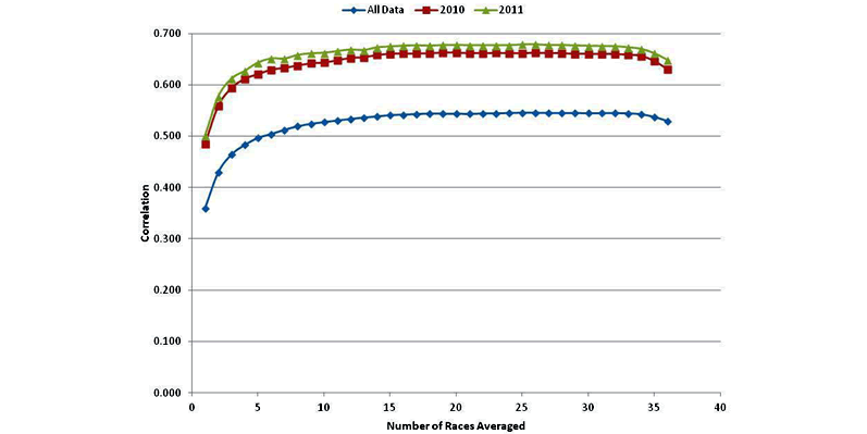
I evaluated the correlation of actual finishing position to the driver's average finish over the last N races. If a driver was only in some of the last N races, the average is over those races he was in. The plot in FIGURE 2 shows correlations for the entire database, and with the years 2010 and 2011 separated out. The curves shown have similar shapes, and all show that averaging over the last 10 races or more give the best results.
However, an obvious question is why 2010 and 2011 are so much better than the entire span of data over the years from 1991 to 2011?
I believe that this is due to recent phenomena of start-and-park, where some drivers with little or no sponsorship will attempt to qualify and then only run a few laps due to cost issues. Those drivers are almost certain to finish very poorly every race and are therefore easy to predict. This raises the overall correlation for those races in a misleading manner.
Limiting Analysis To The Top-35 Finishers
Since the Top-35 cars in owner points are locked into each race and do not start-and-park, I repeated the calculations using only cars that finished in the Top-35. This is shown in FIGURE 3.
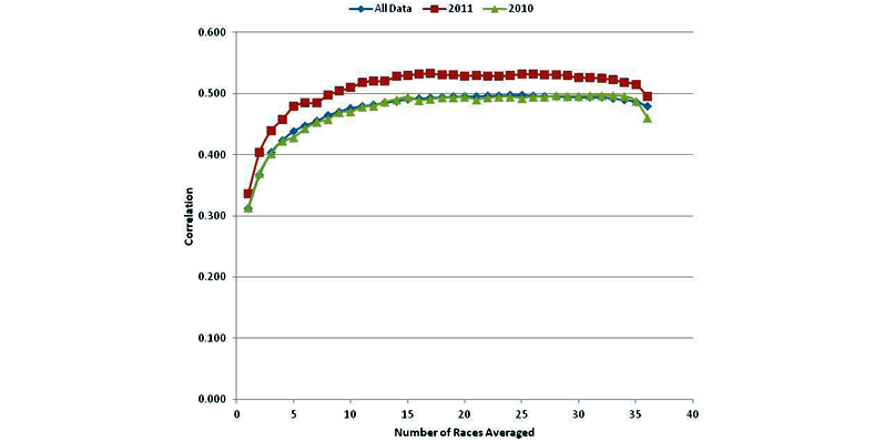
It would be better to look only at drivers in the Top-35 in points (those locked into the race and not likely to start-and-park), but that is not readily available. It would take significant effort to add this to the database. Again, the curve shapes are similar and correlations for 2011 are somewhat above the long-term averages, but the differences are much smaller.
15 Races - Reasonable Number To Average Over All Races
There is rapid improvement as the number of races averaged increases to about 12-15, with little or no improvement above that. Trying to read differences of less than a percent is pushing the data beyond what is reasonable, so I have selected 15 as a reasonable number to average over all races. I wanted the smallest number possible to preserve any information about drivers on hot streaks.
Recent Past Performance - Same Track
Often a driver will excel at a particular track. Denny Hamlin, for example, has always done very well at Pocono.
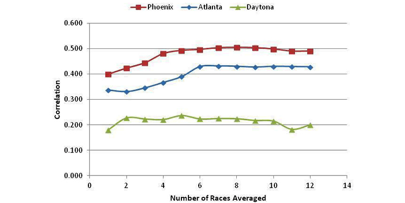
Using the 1991-2011 data, I calculated correlations of actual finishes for all drivers with his average finishing position for each track. Again, only the Top-35 finishers are counted. FIGURE 4: shows the results for three typical tracks: Phoenix, Atlanta and Daytona.
Phoenix and Atlanta
Phoenix and Atlanta show typical curve shapes, with the correlations rising as the number of races averaged gets larger and then flatten out. The curves peak out at 6 or more races.
Daytona
Daytona, on the other hand, has a very poor correlation, no matter how many races are averaged. There may be a few drivers that have done well in the past and will do well at Daytona in the future, but in general, at Daytona, past performance at that track does not imply continued success.
Conversely, poor past performance at Daytona does not necessarily imply another poor finish. In FIGURE 5, I have taken each track's correlation as a function of the number of races and averaged all the tracks together to give the curve in red.
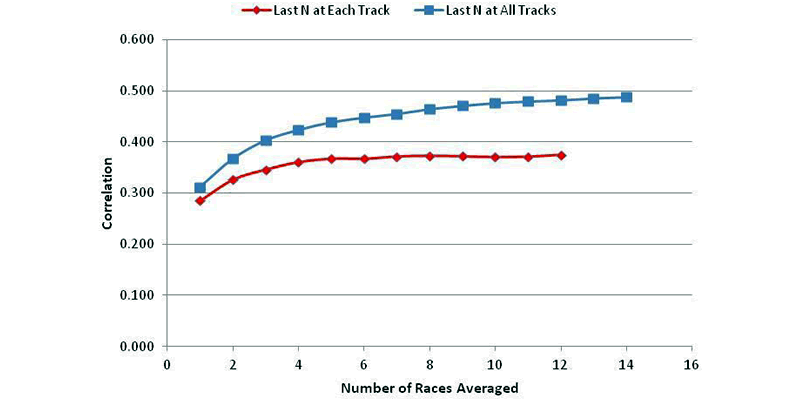
The figure also shows in blue the average correlation for averages from the most recent N races at any track (from FIGURE 3 above).
The two curves have similar shapes: both start relatively low and then improve as the number of races averaged increase.
The correlation for averages at each individual track starts to level out above five or six, while the average for the correlations using all tracks climbs more slowly, and peaks at around 15.
Last Eight Races At The Same Track
Consideration of each individual track's correlation curve suggests that averaging eight races at the same track gives very good performance for this measure.
The table in FIGURE 6 gives each track's correlation for performance averaged over the last eight races. I have also included the last four race averages, since I have frequently used that in the past.
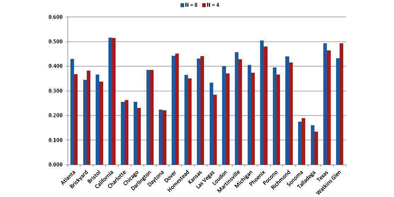
For almost all tracks, averaging over eight races improves correlation over the four-race averages, but not by much.
These correlations are also seen to be lower than the correlations over the last 15 races at all tracks (see FIGURE 5).
Last 15 Races Is Better Than Last Eight At Same Track
In other words, average driver finishes over the last 15 races at all tracks is a better indicator of how well he will do at a particular track than his past finishes at the same track. Of course, in the AccuPredict method, both performance measures will be used to estimate driver finishes. Notice also that some tracks are not correlated well at all to past performance at that track:
- California
- Chicago
- Daytona
- Sonoma
- Talladega
One possible explanation for the most recent 15 races at all tracks being a better indicator than the most recent eight races at a specific track is the time interval covered.
The last 15 races at any track is almost half a season, or about half a year, while the last eight races covers the past four or eight years of data at that track, depending on whether one or two races are run each season at that track (such as once yearly races at Chicago or biannual races at Martinsville).
I suspect that the reason for needing to average over several races, even over several years at some tracks, is due to accidents or other problems, like flat tires, that could skew a driver's performance downward and distort his performance unfairly. It is interesting to note that the need to use several races is more important than reflecting a hot streak over a few races, that is, driver consistency for the long haul is more important.
One way to decrease the time interval for measurement of a driver's performance is to look at performance at similar tracks.
Past Recent Performance - Similar Tracks
For example, Jeff Gordon always does well at flat tracks, such as Martinsville and Loudon. There are several races each year at flat tracks, so averaging over the past eight races at flat tracks would only cover races during the past year and therefore would reflect more recent performance, rather than requiring several years' performance at an individual track. Tracks can be grouped by several means: until now, the most accurate grouping that I have seen is illustrated below in the FIGURE 7 table.
TRADITIONAL TRACK GROUPINGS
| Flat Tracks | Shallow Tracks | Steep Tracks | Cookie Cutter Tracks | Road Course | Restrictor Plate | ODD 1 | ODD 2 |
|---|---|---|---|---|---|---|---|
| FIGURE 7 - Traditional Track Groupings | |||||||
| Martinsville | Indianapolis | Bristol | Atlanta | Infineon | Daytona | Chicagoland | California |
| New Hampshire | Pocono | Darlington | Charlotte | Watkins Glen | Talladega | Kansas | Michigan |
| Phoenix | Dover | Texas | Kentucky | ||||
| Richmond | Homestead-Miami | ||||||
| Las Vegas | |||||||
This track grouping is based on track physical similarities of track length and corner banking, and was made by Christopher Harris of ESPN in 2007. The ODD tracks are those that do not fit nicely into the other categories, but have some similarities to others in the same ODD listing.
Testing The Theory Of Similar Track Groupings
The theory for similar track groupings is that a driver's performance at all alike tracks will be consistent. To evaluate this, I looked at the 1991-2011 database and correlated each driver's finish to his average performance at previous races at tracks in the same grouping.
For example, I looked at Bristol finishes for each driver against the average finish over the last N races at any steep track. This may include previous races at Bristol. When these averages for Bristol based on steep tracks are plotted against averages over all steep tracks, you would expect similar shaped curves if Bristol is properly classified as a steep track and the supposition of similar performance holds.
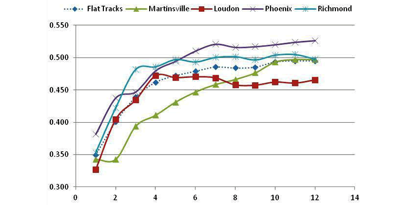
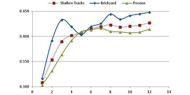

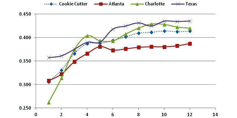


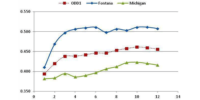
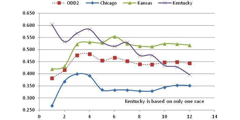
The graphs contained in FIGURE 8 shows the results for all eight groupings of tracks.
- Curves are generally tightly clustered for Flat Tracks, Steep Tracks and Restrictor Plate Tracks, and have similar shapes for Road Course Tracks.
- Curve shapes are somewhat different for Shallow Tracks and Cookie Cutter Tracks.
- The ODD1 and ODD2 Tracks, plus Road Courses, have curves that are spread out.
- Kentucky is based on only one result so little can be determined for that track.
Note also that tracks, such as Chicago, Watkins Glen and the plate tracks are poorly correlated to other tracks in their categories. Most of the curves in general show their best correlation for an average taken over the past eight races of tracks in the same category.
My Revisions To The Similar Track Groupings
Some tracks were regrouped because of these results. It was found that including the ODD tracks with the Cookie Cutter Tracks was advantageous. This revised category was named Large Ovals and its performance is shown in FIGURE 9. Again, the average over the last eight races is a good measure of performance.
Large Oval Track Grouping
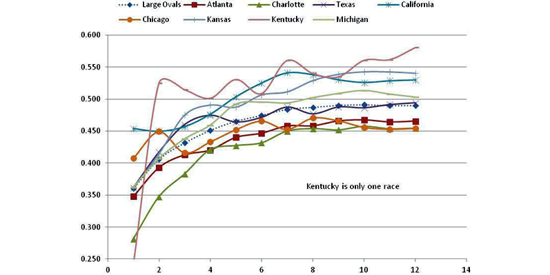
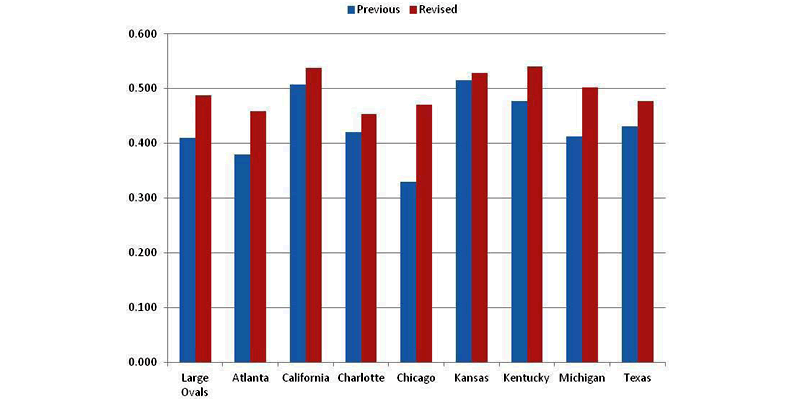
This shows a fairly tight clustering of the curves and improved correlations for each of the member tracks with average finishes over the other tracks in the Large Ovals category. The exception is still Kentucky, based on only one race, and therefore not a concern. The correlations for these tracks in the new Large Oval category are shown in FIGURE 10 for their previous grouping of track types and the revised category of Large Oval.
Results are for eight races averaged. All tracks in this new category perform better and Chicago's correlation is much improved and is now on a par with other tracks in this category. Michigan and Atlanta are significantly improved as well.
Combining The Flat And Shallow Track Groups
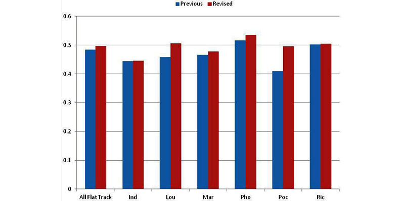
Indianapolis and Pocono, grouped as Shallow Tracks, offered only three races per year, and therefore were grouped into the Flat Tracks category. Results are given in FIGURE 11 for eight-race averages, and show improvement in all Flat Track correlations. Pocono in particular is better correlated with this new grouping of Flat Tracks.
Road Course And Restrictor Plate Groups
There are no obvious re-classifications for Road Course or Restrictor Plate Tracks. When the four of them were grouped together as an excursion, the correlations were improved for Plate Tracks, but the Road Course results were worse than the original groupings. There does not appear to be any justification for regrouping these tracks.
REVISED SIMILAR TRACK GROUPS
| Flat Tracks | Steep Tracks | Large Oval Tracks | Road Course | Restrictor Plate |
|---|---|---|---|---|
| FIGURE 12 - Revised Similar Track Groups | ||||
| Indianapolis | Bristol | Atlanta | Infineon | Daytona |
| Martinsville | Darlington | California | Watkins Glen | Talladega |
| New Hampshire | Dover | Charlotte | ||
| Phoenix | Homestead | Chicago | ||
| Pocono | Las Vegas | Kansas | ||
| Richmond | Kentucky | |||
| Michigan | ||||
| Texas | ||||
Testing The Revised Track Groups
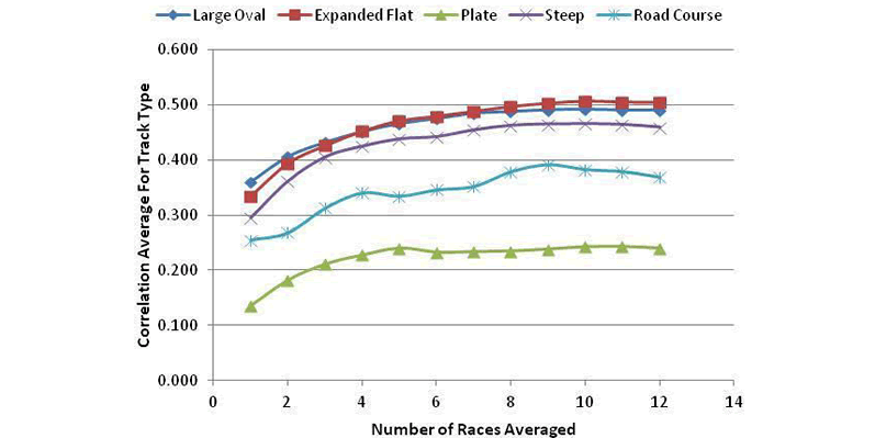
In FIGURE 13 are the correlation averages for the revised track types.
- Curves all increase with the number of races averaged and plateau near eight races.
- Large Oval and Expanded Flat Tracks have the highest correlations, with Steep Tracks close behind.
- Road Course and Restrictor Plate Tracks are relatively poorly correlated.
Practice As A Metric
There are at least two practices each race weekend, except in the case of rain-outs, and sometimes there are more. The last practice is called Happy Hour. Happy Hour sometimes is after qualifying, but more often in recent years, it is before qualifying. When before qualifying, some drivers are making mock qualifying runs and those are generally faster than practice in race trim.
So, performance in Happy Hour may not be the best comparative measure of a driver's upcoming performance. In addition, practice speeds are sometimes measured as the fastest lap a driver has made, and sometimes as the best 10-lap average speed for those drivers that run at least 10 consecutive laps. TV commentators often have commented about the value of the 10-lap averages. Average speeds for each practice session are also available.
Practice is not usually intended to give the driver a rehearsal at a particular track, that is to familiarize him with the track itself, but serves as a means to dial in the car's handling characteristics and to understand how to adjust the car as the track changes. A driver who dominates in practice almost always does well in the following race. A comprehensive database of the various practice measures does not seem to be available, so I went back over the 2011 season and put together various statistics for each race.
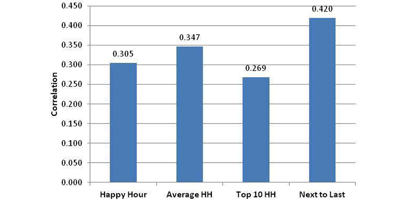
The correlations of finishing position to several practice measures are shown in FIGURE 14. The bar labeled Happy Hour is a ranking of the fastest Happy Hour speeds, while Average HH is the average speed during Happy Hour. The Top-10 laps in Happy Hour are shown.
Because of the mixture of race trim and qualifying trim during Happy Hour, I also looked at peak lap speeds in the practice just prior to Happy Hour. This is often the first practice, which also serves to set the qualifying order and is therefore important to the driver. As the chart shows, the fastest laps in the next to last practice are the best measure of practice, and the correlation achieved of 42% is about the same as the other measures discussed so far in this analysis.
Qualifying As A Metric
Qualifying is important in multiple ways to a driver.
- It is an obvious measure of how fast a driver can run a single lap.
- Pit selection is chosen by a team in the order of the qualifying results, and it may give the driver an easier (faster) entry and/or exit from his pit stall, and less chance of a pit road mishap.
- The qualifying result is also the starting position and this can be very important at tracks where it is difficult to pass.
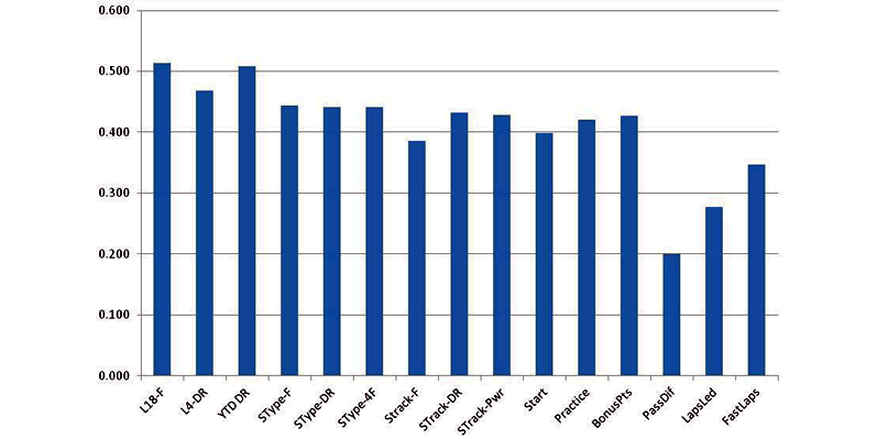
The correlation of starting position to finish position is shown in FIGURE 15 for the last several seasons. Some drivers are required to start at the end of the field because of an engine change, for example, and those drivers are treated here by how they qualified. It is not clear why the correlation has improved with time. Correlations for the 2011 NASCAR season are again about 40%, which is about the same as the other performance measures examined this far.
This is the conclusion of Cliff's original article about his Accupredict method. The article below is Cliff's latest analysis of the metrics used to confirm they continue to provide optimal projections.
Accupredict Relook 2021
By Cliff DeJong
Since results in NASCAR Fantasy League using ACCUPREDICT predictions have been relatively poor in 2021, while being good in prior years, I wondered if something fundamental had changed in 2021. I was also curious about 2020, since much of the year was run without practice due to COVID. Darren gave me ACCUPREDICT results from 2012 through the 2021 Darlington race. I added results from the 2021 Dover race to the database.
ACCUPREDICT combines several metrics to form the predicted finish. I looked at the correlation of each of these metrics to finish position. I originally also looked at correlations to NASCAR Fantasy Points scored, but found they were 95% correlated to finish position.
Here are the correlations for several years of data. For each row, results are also color coded, with green being the best and red the worst.
| AVG FINISH | YTD DR | TYPE | TRACK | START | PRACTICE | RANK | PRED FIN | |
|---|---|---|---|---|---|---|---|---|
| FIGURE 16 - Correlations for Different Years | ||||||||
| 2021 YTD | 0.536 | 0.615 | 0.518 | 0.444 | 0.413 | ---- | 0.569 | 0.586 |
| 2020 | 0.589 | 0.645 | 0.578 | 0.557 | 0.541 | 0.499 | 0.605 | 0.623 |
| 2012-2021 | 0.598 | 0.614 | 0.585 | 0.545 | 0.535 | 0.562 | 0.616 | 0.630 |
| 2012-2019 | 0.601 | 0.611 | 0.589 | 0.547 | 0.536 | 0.564 | 0.618 | 0.632 |
Here is a plot of the data:

Observations
- The year-to-date performance of Accupredict (13 races into the 2021 season) is worse than its long term averages.
- The year-to-date Driver Rating metric correlation has stayed close to the same for all years.
- For the 2021 season (13 races thus far) all other metrics are worse.
- Year-to-date Driver Rating is a very good metric for all years.
- Rank is not as good as Year-to-date Driver Rating for the last two years.
- For 2020 or 2021, else same.
- 2021 poor showing could be partially due to 3 races not easily predicted.
- WO DRC and Restrictor Plate, much better.
- Restrictor Plate and Road Courses are 23% of the 2021 season, vs 16% for most seasons.
- Restrictor Plate are 15% of the 2021 season, vs 11% for most seasons
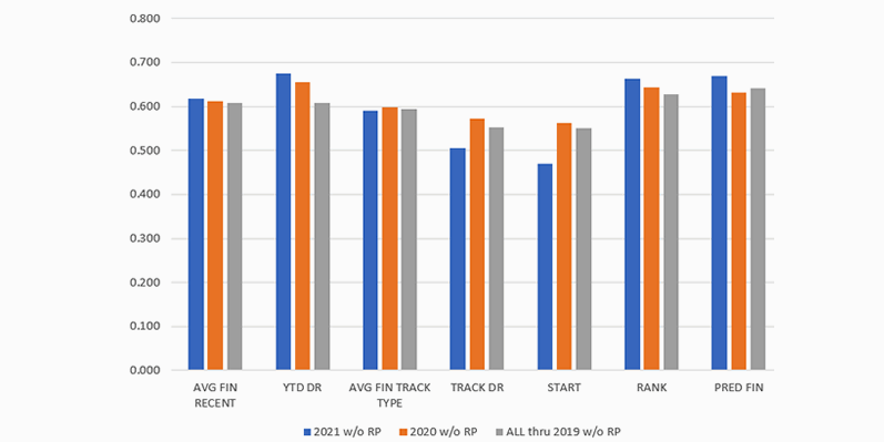
The most important observation is that 2020 results are not much different from the long-term averages. 2021 has a rather poor showing for all metrics, but little worse than other years in the overall rank of drivers. Because there are a higher percentage of restrictor plate races in 2021, the analysis was repeated without RP races. Practice was not a part of most 2020 and 2021 races, so that metric was deleted. The table FIGURE 18 shows the correlations and the plot FIGURE 19 shows the same data.
| AVG FINISH | YTD DR | TYPE | TRACK | START | RANK | PRED FIN | |
|---|---|---|---|---|---|---|---|
| FIGURE 18 - Correlations for Different Years Without Restrictor Plate Races | |||||||
| 2021 YTD without Restrictor Plate Races | 0.617 | 0.675 | 0.591 | 0.505 | 0.470 | 0.663 | 0.670 |
| 2020 without Restrictor Plate Races | 0.612 | 0.656 | 0.599 | 0.572 | 0.562 | 0.644 | 0.632 |
| 2012-2019 without Restrictor Plate Races | 0.609 | 0.608 | 0.595 | 0.552 | 0.550 | 0.628 | 0.642 |
Here is a plot of the data:
Observations
- Overall results are about the same (Rank and Predicted Finish).
- Slight improvement for 2021.
- Rank is about the same as Year-to-date Driver Rating, and both are better than other metrics.
- Same Track and Start is less important in 2121 than in 2020 or pre-2019.
- Year-to-date Driver Rating is more important the last two years.
- YTD DR is better than Rank and Pred Fin for the last two years.
- But not for pre-2019 data.
- 2020 is about the same as pre-2019.
- 2021 is a partial year, and that could distort results.
It seems to me that 2021 is not very different from previous years. The lack of practice for 2021 also happened for much of 2020, and 2020 matches the long-term averages well. Because of that, I conclude that differences seen in 2021 are mostly due to the fact that we have only had 13 races so far.
As for my performance in NASCAR Fantasy League, there are several opportunities for bonus points, so I have not done well in those. I did a short analysis of trying different combinations of metrics and was unable to improve on the current method.